return to news
  1. What’s in a logo? A lot more than you think

Upstox Originals

What’s in a logo? A lot more than you think

Rashi Bisaria

4 min read | Updated on April 03, 2025, 18:58 IST

Twitter Page
Linkedin Page
Whatsapp Page

SUMMARY

A logo isn’t just a brand’s face, it’s the soul, packed into a tiny, visual punch. It tells a story, stirs an emotion, and builds a connection in the blink of an eye. Logos are known to cut through the noise, create lasting impressions, and drive decisions faster than you can Google the competition.
What’s in a logo? A lot more than you think

What’s in a logo? A lot more than you think | Image: Shutterstock

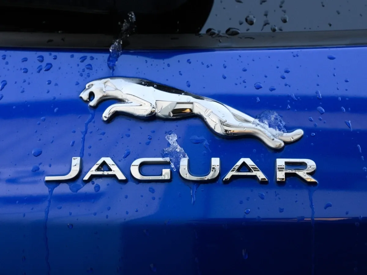
A fresh vibe, a new personality, and a bold promise. That’s what the British luxury car manufacturer Jaguar is banking on with its latest rebranding exercise as it gears up to conquer the electric car space.

What’s new? Oh, just a sleek new logo, a revamped “leaper” cat design, and a slogan that says it all: “Delete Ordinary.

The logo now blends uppercase and lowercase letters. But you might ask, “So what?”

What’s in a logo? Lots, actually.

They’re not just doodles or fancy fonts. They’re powerfully crafted designs. They whisper, they shout. They grab our attention, stir our emotions, and influence our buying decisions before we even know it. Colors, shapes, fonts! They’ve been secretly working on our psyches for decades, shaping our choices.

In short, a great logo doesn’t just make you look twice, it makes you loosen your purse strings. And brands that have redesigned their logos smartly have done more than just freshen up their image, they’ve raked in serious cash.

Logo revamps that grew revenues
Burger King (2021): When Burger King went full retro with its logo, it wasn’t just a nostalgia trip. It was a declaration: “Fresh ingredients, fresher vibe.” Sales soared by 8% in Q2 2021 compared to the same period in 2020.
Pepsi (2008): Middle of a global financial crisis? No problem. Pepsi dropped a shiny new logo in 2008, backed it with a billion-dollar rebranding spree, and grabbed a 1.2% bump in US market share within months.
Starbucks (2011): By removing the word coffee from its logo, Starbucks shouted, “We’re more than just your caffeine fix!” Turns out, they were right. Their Q2 2011 revenue jumped by 8% from the previous quarter. Who knew logo minimalism could pack such a punch?
Mastercard (2016): What happens when you ditch the text on your logo and let your iconic circles do the talking? For Mastercard, it meant a 9% year-over-year revenue spike in Q4 2016. Less is definitely more.

Logos: The secret sauce of the auto industry

Cars aren’t just vehicles—they’re identities on wheels. And their logos? They carry within them the aspirations and legacies of the brand.

Renault (2021): Renault’s geometric diamond logo wasn’t just a redesign—it was a declaration. “We’re sustainable, we’re innovative, and yes, we’re cool.” Customers loved it, especially paired with its EV launch.
Kia (2021): Out with the dated oval, in with a futuristic continuous-line logo. In 2021, South Korean auto manufacturer Kia replaced its oval logo with a sleek, futuristic logo, spelling "KIA" in a continuous line. The redesign was again part of Kia’s rebranding initiative to focus on electric and sustainable vehicles. They were trying to tell a new story with a new black and white logo which lent it more sophistication. The slant of the font also lends it a futuristic appeal. Kia repositioned itself as a forward-thinking, futuristic brand. Sales revved up by 6.5% globally in 2021, and EVs stole the spotlight. Kia’s message? “We’re forward-thinking, we’re sleek, and we’re driving into the future.”
BMW (2020): Dropping the classic black ring for a minimalist flat design? Bold move, BMW. While some fans were initially miffed, the move screamed “modernity,” perfectly aligning with its sustainability-focused electric vehicle push and sales reflected that shift.
Porsche (2023): Celebrating its 75th birthday with a subtle yet powerful logo tweak, Porsche bridged its storied past with its ambitious future. A class act, as always.

So, how much power does a logo wield?

A logo isn’t just a brand’s face, it’s the soul, packed into a tiny, visual punch. It tells a story, stirs an emotion, and builds a connection in the blink of an eye. Logos are known to cut through the noise, create lasting impressions, and drive decisions faster than you can Google the competition.

The function of the logo is much more than mere self-expression. It can be the shortest means to connect with customers, shaping the first impression of a business. The colours and graphics can transcend language barriers to establish a global identity.

For Jaguar, its EV Concept Type 00, unveiled hot on the heels of its rebrand, is proof that this isn’t just a facelift. It’s a statement the auto brand has made. The bold new logo reflects the brand’s journey toward artistry, innovation, and sustainability. Sure, auto enthusiasts could argue over the design. But one thing is certain: Jaguar is on a mission to delete ordinary.

And with a logo like that, it just might succeed.

About The Author

Rashi Bisaria
Rashi Bisaria is a storyteller with more than two decades of experience in the media industry across print, TV and digital. She likes to get to the heart of a story to share a balanced perspective and reveal the facts.

Next Story